Context
eMoney builds dense wealth software — multi-year projections, stacked charts, print-ready tables, mobile views of the same story. Behind that sits Kyber, our design system, and a team that lives in Figma while the rest of the company lives in Jira and Confluence.
I kept watching the same tax get paid. A designer finishes a report screen, leaves Figma to file a ticket, paste a screenshot, write a spec, and hopes the components they used were still real Kyber instances. Meanwhile the tools that promised to speed us up — Claude Design, screenshot-to-mockup, generic AI canvases — would land something that looked close: hardcoded hex, no variables, no auto-layout, charts that weren’t ours. Pretty, and then an afternoon of cleanup.
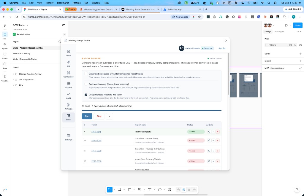
I designed and built eMoney Design Toolkit as a Figma plugin — first a small pattern-capture experiment, then the thing it actually needed to be: a sidebar for Jira, Confluence, file hygiene, audits, and AI that instantiates Kyber instead of ignoring it.
The problem
Design work doesn’t fail because Figma is hard. It fails because Figma is an island.
Linking a frame to a ticket shouldn’t require a browser treasure hunt. Publishing a design doc shouldn’t mean rebuilding the page in Confluence from memory. And AI-generated UI that ignores your component library creates more cleanup work than it saves.
The test I kept using was selfish: if I still had to alt-tab to do the boring parts, it wasn’t done.
Stay where the work is
The plugin became the place those jobs happen.
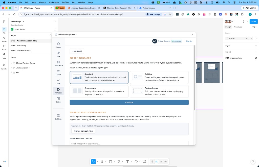
Select a frame, search a Jira issue, attach a screenshot that actually embeds in the comment, drop a Figma link, move on. Send a section to Confluence as a real page — then re-analyze it when the design changes, without picking the destination twice. Generate a table of contents for a sprawling file. Set In Progress / Pending Review / Ready for Dev from the right-click menu, the way you’d set a layer name.
None of that is glamorous. It’s what makes a toolkit feel native inside Figma instead of a science-fair booth.
Make Kyber executable
A design system that only exists as a library will lose. People detach, recreate, pick a close-enough hex, and ship.
Audit runs Kyber foundation checks plus a visual pass on any selection — findings with blocker, warning, or suggestion severity, plus safe fixes where possible. The Component Inspector compares variants against what Kyber actually expects and can bind unbound variables instead of leaving that as a lecture.
The most-used shortcut might be the least glamorous: Apply Kyber Magic. Claude Design (and friends) still arrive as SVGs and loose frames. Magic walks the selection, binds fills, strokes, and text to the closest Kyber variables and text styles, adds auto-layout only where it won’t destroy a diagram, then runs the fixable audit rules. One undo reverts the whole pass. It’s not pixel-perfect — it’s “stop spending an hour turning someone else’s hex into our tokens.”
AI that already knows the house
The interesting AI problem wasn’t “generate a screen.” It was “generate a screen we can keep.”
Generic models invent bar charts. They don’t instantiate our bar chart, with our tokens, across desktop, mobile, print, and the tiny ribbon glyph that has to read at 84×54.
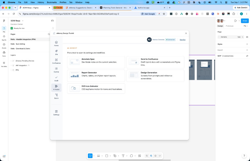
Report Generator renders Kyber modules — charts, tables, metric cards — aligned the way the library requires. Describe the report, paste data, or pull from an epic, then sync other views from desktop or generate the rest from a handmade frame.
Design Generation is the cousin for product UI. Prompt, optional references, and a new frame on the canvas — not an overwrite — using the same component map wherever a chart, table, button, or badge belongs. If the slot isn’t mapped, it falls back to primitives instead of hallucinating a fake library piece. A slightly boring frame you can edit beats a beautiful lie.
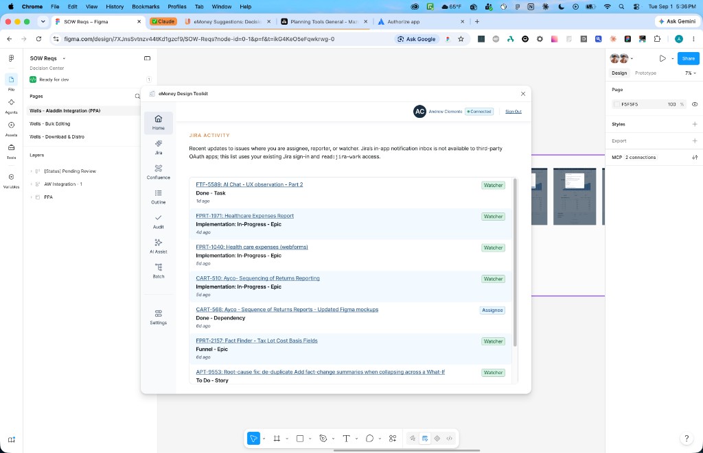
Batch exists because we had a backlog, not because dashboards are fun. A CSV of tickets or library components, a queue that can pause and resume on another machine, optional Jira linking with screenshots and Figma URLs attached to each ticket. The unsexy work of a design system at scale.
What I learned
The constraint is the product. Letting a model “be creative” with wealth-report UI created more work than it saved. Teaching it our components, tokens, and views — and meeting leftover mess with Magic and Audit — is what made the tool worth opening.
I built this by being the primary user, which is a terrible way to stay humble and a good way to notice the gaps. Menu commands for the things you do twenty times a day. Linked frames that sync when you’re signed in. Screenshots that resolve to something visible in Jira. If you’re going to design internal tools, ship them — using your own plugin every day is the shortest research cycle I know.