Lead Product Designer2018–PresentFinTech · Complex UI · Design Systems

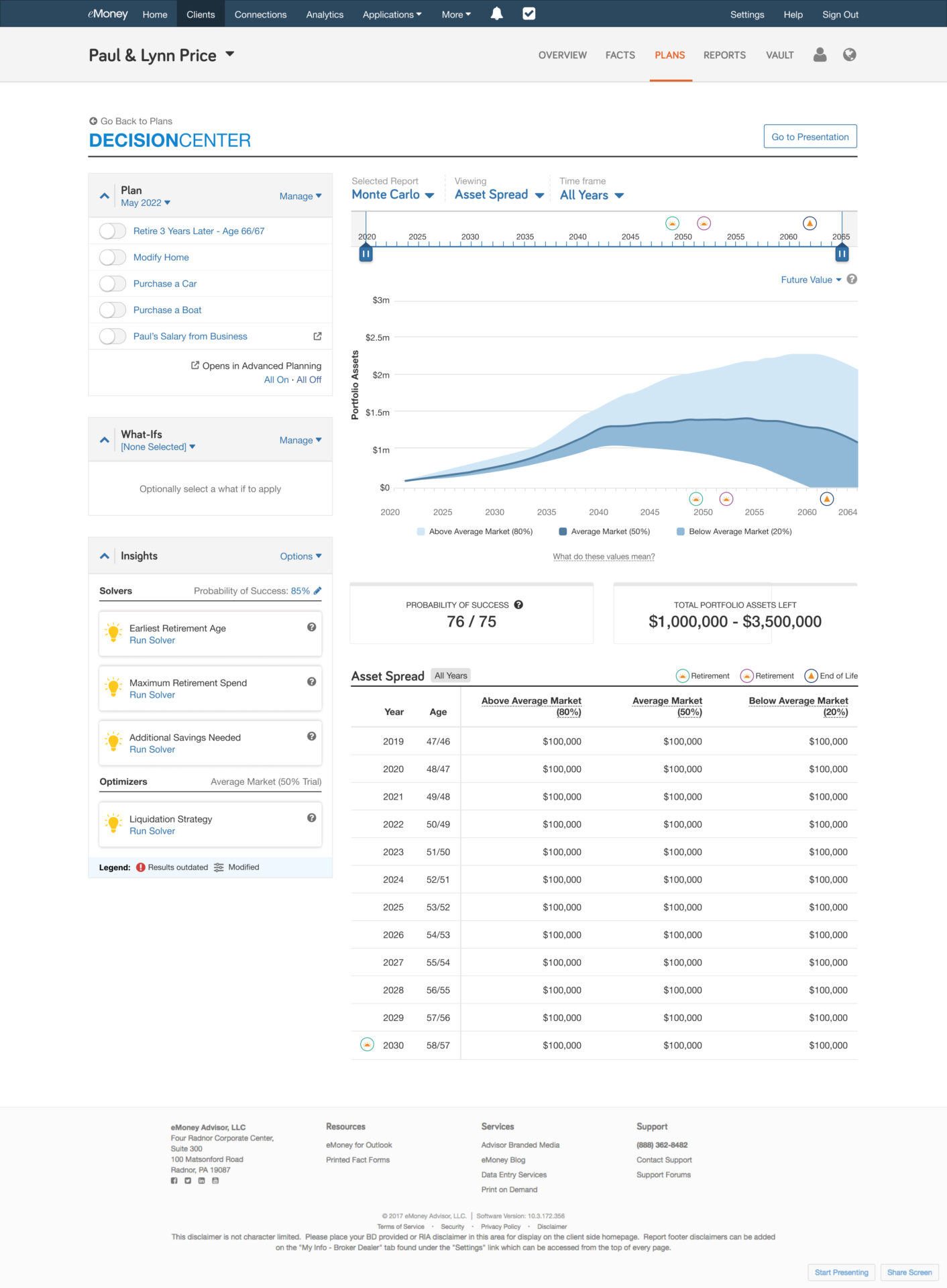
eMoney Decision Center

UX lead for Decision Center — the live workspace advisors use to model financial plans with clients.

eMoney Decision Center interactive Monte Carlo wealth projection canvas

Context

Decision Center is eMoney’s core planning workspace. Advisors use it in client meetings to adjust assumptions — retirement age, spending, asset mix — and see projections update in real time.

Before this work, planning often meant exporting long PDF reports. The product goal was simpler: make the meeting itself the deliverable.
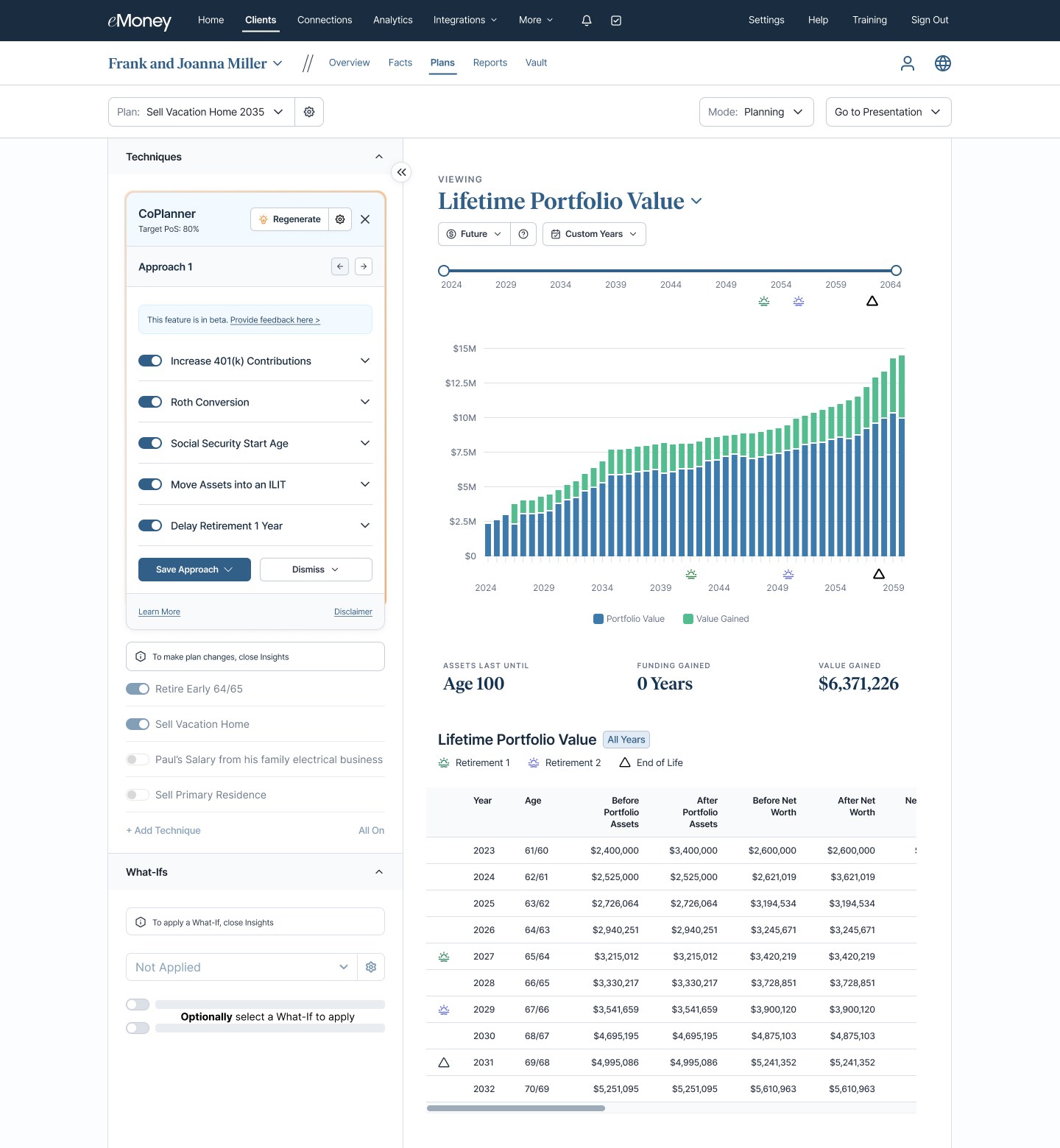
eMoney Planning mode with techniques and what-ifs beside a Lifetime Portfolio Value chart and year-by-year table
Planning mode. Techniques and what-ifs sit on the left; the Lifetime Portfolio Value chart, key metrics, and year-by-year table update together on the right.

What made this hard

Financial planning UIs carry a lot of data at once. Tax brackets, cash flows, Monte Carlo ranges, legacy goals — all interlinked. The interface had to work for the advisor who wants detail and the client who needs the headline.

Calculations also had to feel instant. If a slider lagged, the whole experience fell apart.
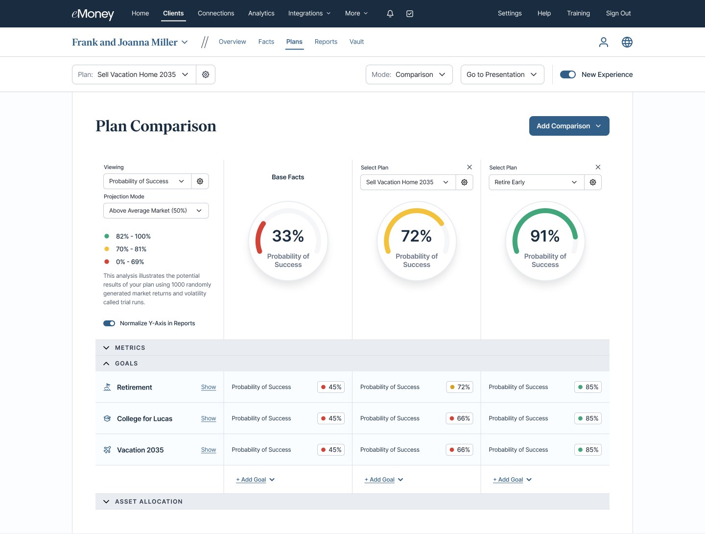
eMoney Plan Comparison showing base facts against two alternate plans by probability of success
Plan Comparison. Base facts against two what-if plans, scored by probability of success overall and for each goal.

What I worked on

Unified canvas. Brought charts, timelines, and tabular detail into one synchronized view so advisors weren’t jumping between screens mid-conversation.

Scenario modeling. Designed a drawer for staging what-if changes and comparing outcomes against the current plan without losing context.

Design system foundations. Worked with engineering on chart patterns, data-dense components, and accessible color states that other eMoney teams could reuse.
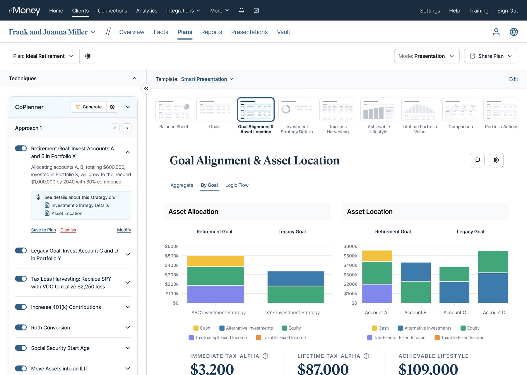
eMoney CoPlanner panel listing planning techniques next to a Goal Alignment and Asset Location report
CoPlanner suggests an approach as a stack of techniques. Each one explains its impact and links to the report page that backs it up.
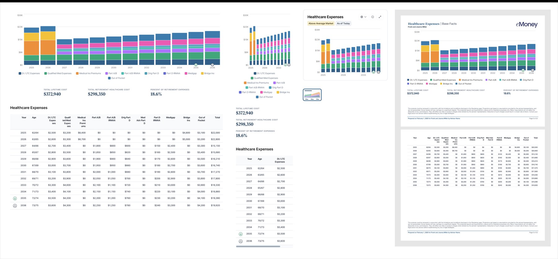
eMoney Healthcare Expenses report shown at full width, in a narrow panel, as a widget, and as printed PDF pages
The Healthcare Expenses report designed once for the full workspace, a narrow panel, a dashboard widget, and the printed PDF.

Outcome

Decision Center became the default presentation surface for enterprise and independent advisors on the platform. The patterns we established — canvas layout, scenario flow, chart components — carried into later analytics work across the product.
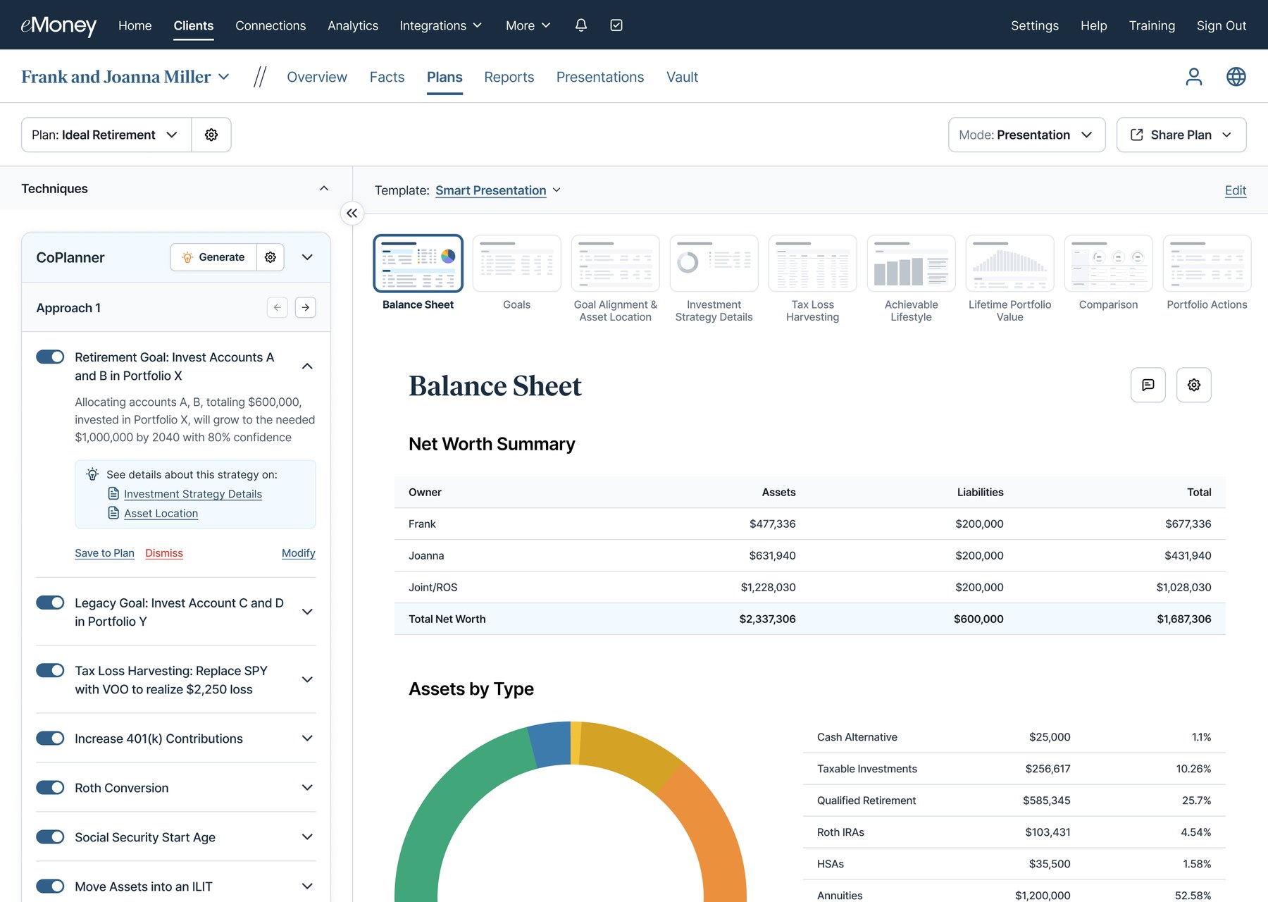
eMoney Presentation mode with a Smart Presentation template ribbon and a Balance Sheet page
Presentation mode. A Smart Presentation template turns the same plan into a page-by-page client deck, starting with the balance sheet.