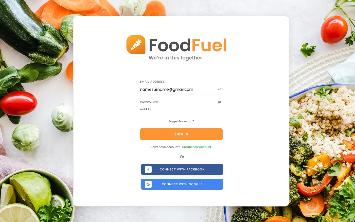
FoodFuel was designed in 2021 for Structure House, a weight loss and nutrition center in North Carolina where members stay for weeks at a time. The brief was one web system for everyone involved: members choosing meals and tracking their progress, the kitchen preparing orders, and staff following each member’s results. The center decided not to launch it, so it lives here on the Workbench.
What it covers
My planning notes listed everything the center needed: a kitchen interface, nutrition tracking, exercise data, food sensitivity testing, training videos, appointment schedules, historical reports, and a digital diary. The design grew into four connected areas.
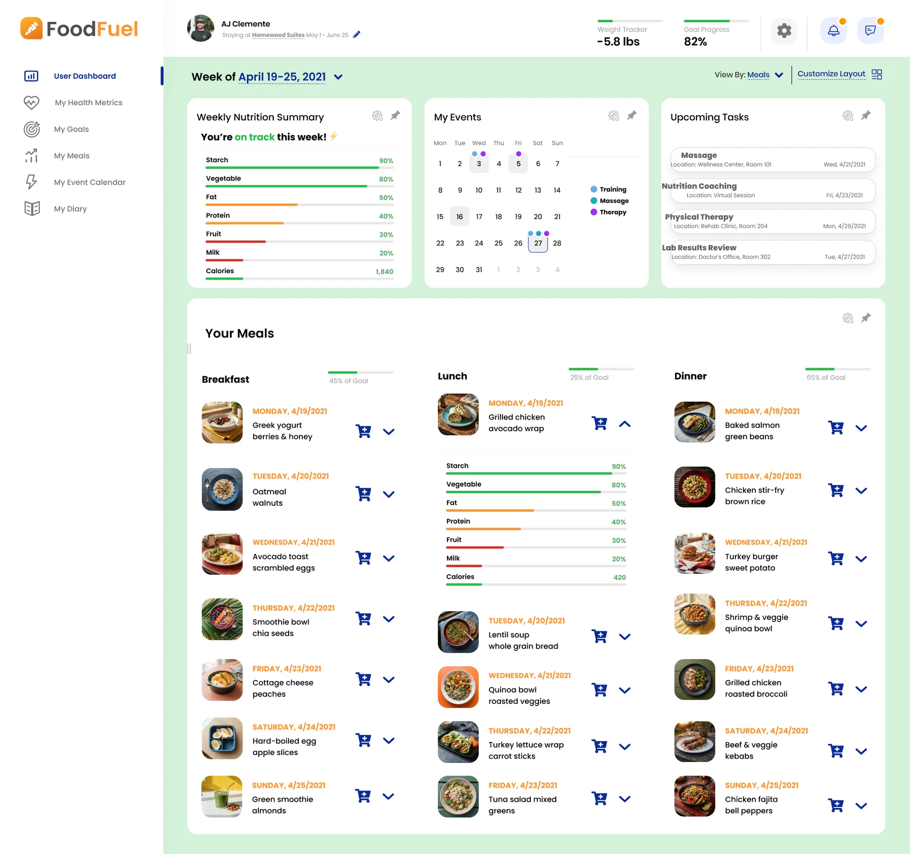
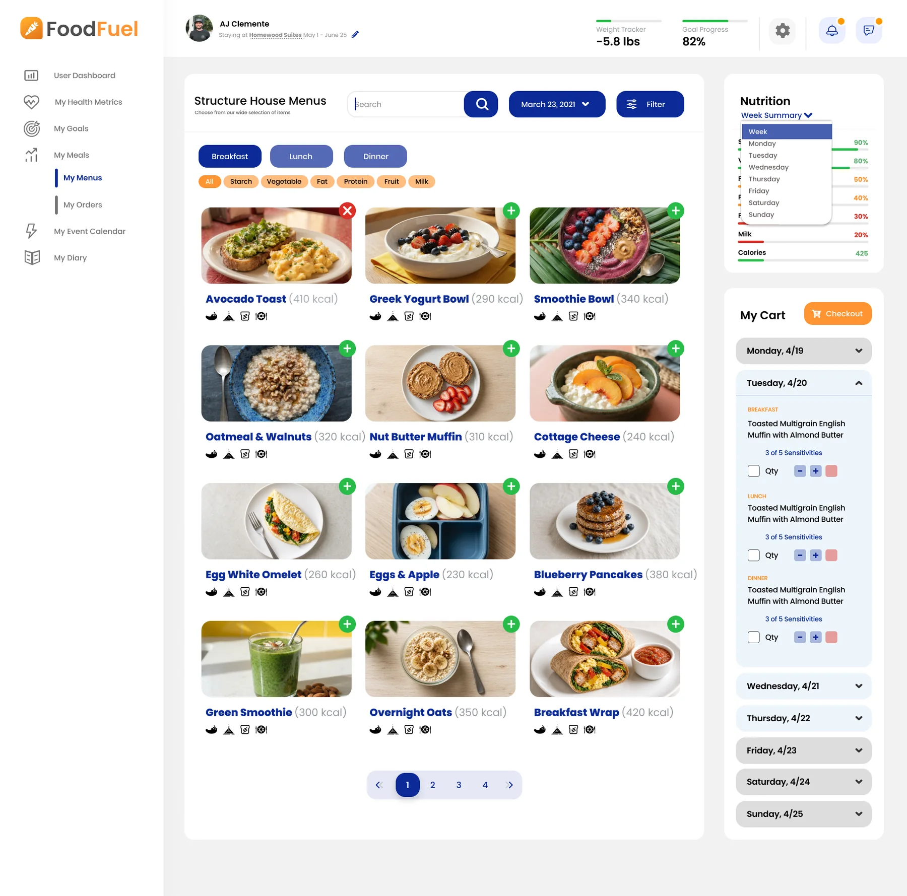
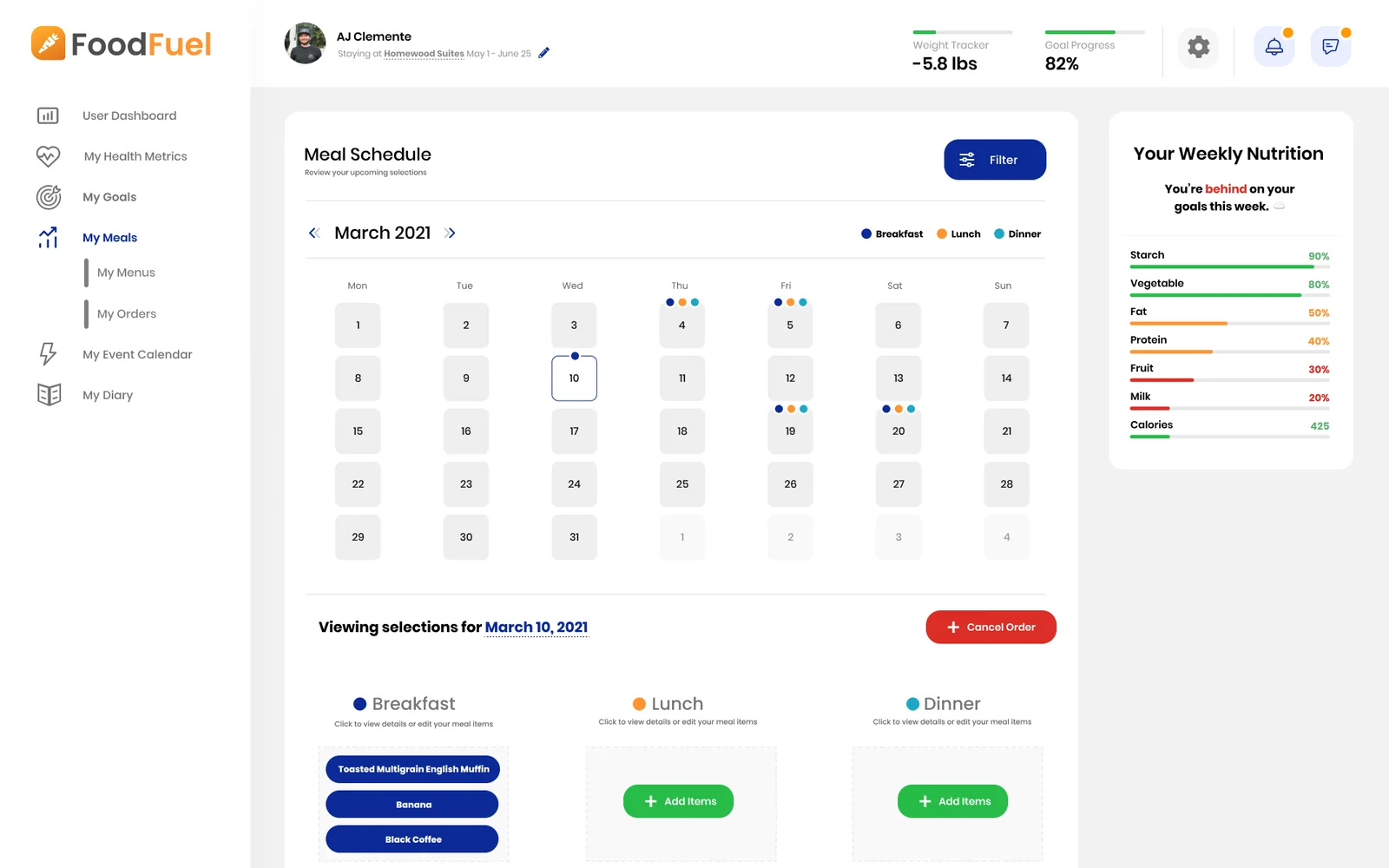
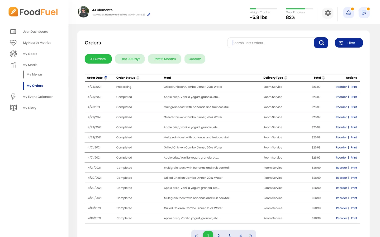
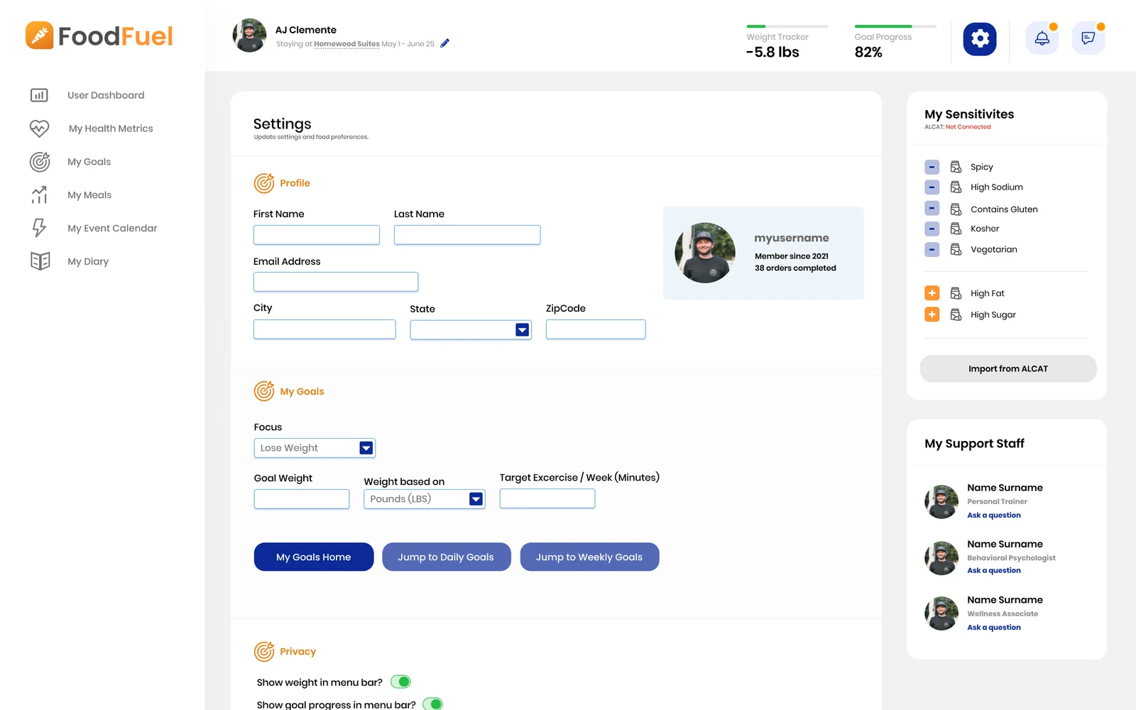
- Meals: members browse the menus by date and meal, filter by food group, and build a week of orders. Each member’s food sensitivities live in their profile and can be imported from their ALCAT test results, and the cart flags how many of them each meal includes.
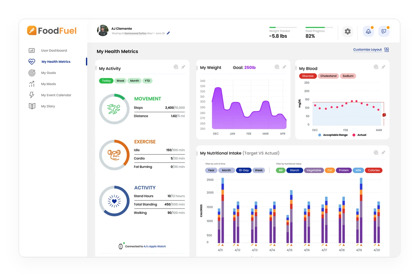
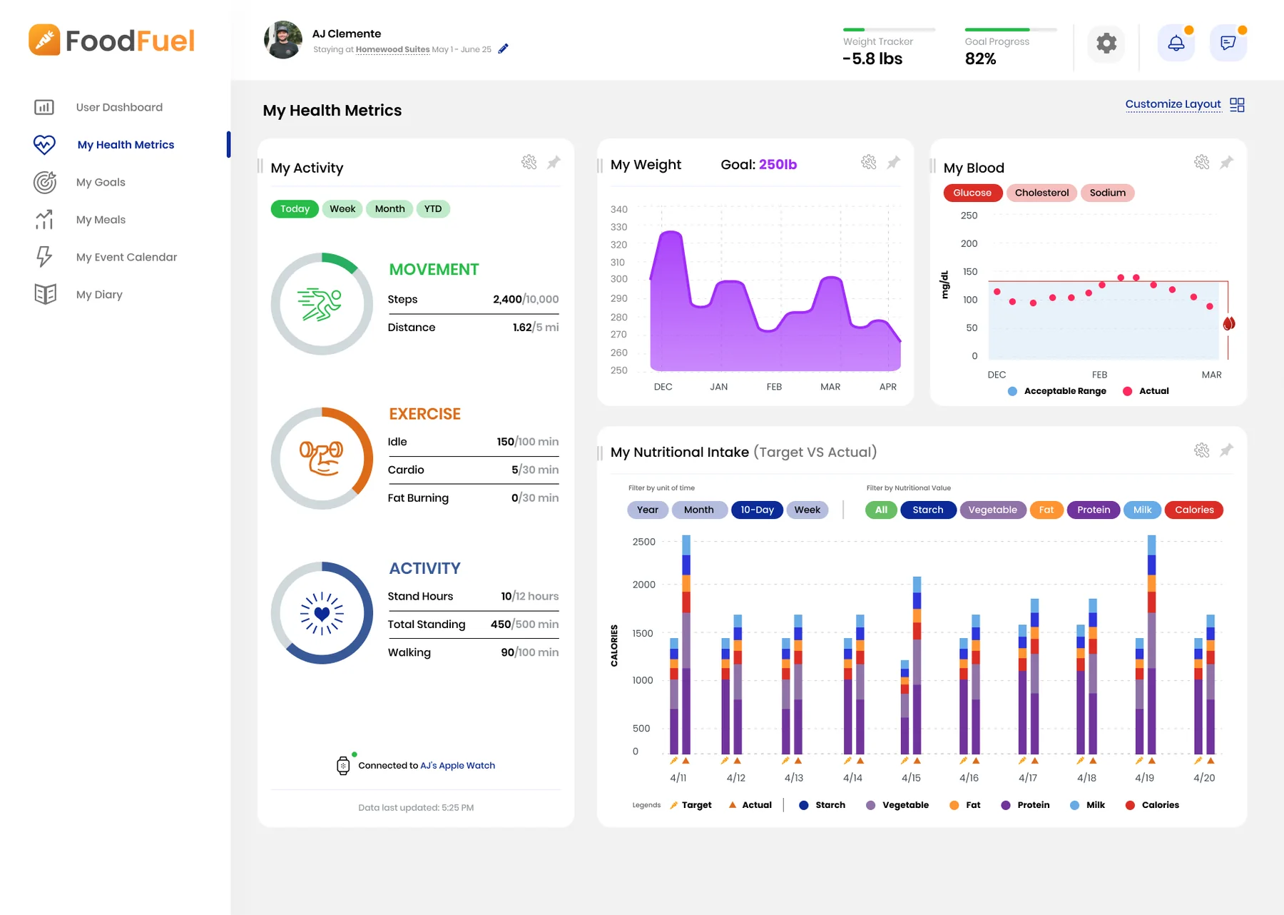
- Health: activity synced from an Apple Watch, weight against a goal, a blood panel for glucose, cholesterol, and sodium, and nutritional intake charted as target against actual.
- Daily life at the center: a diary check-in, goals, therapy and massage appointments, and cooking and exercise training videos.
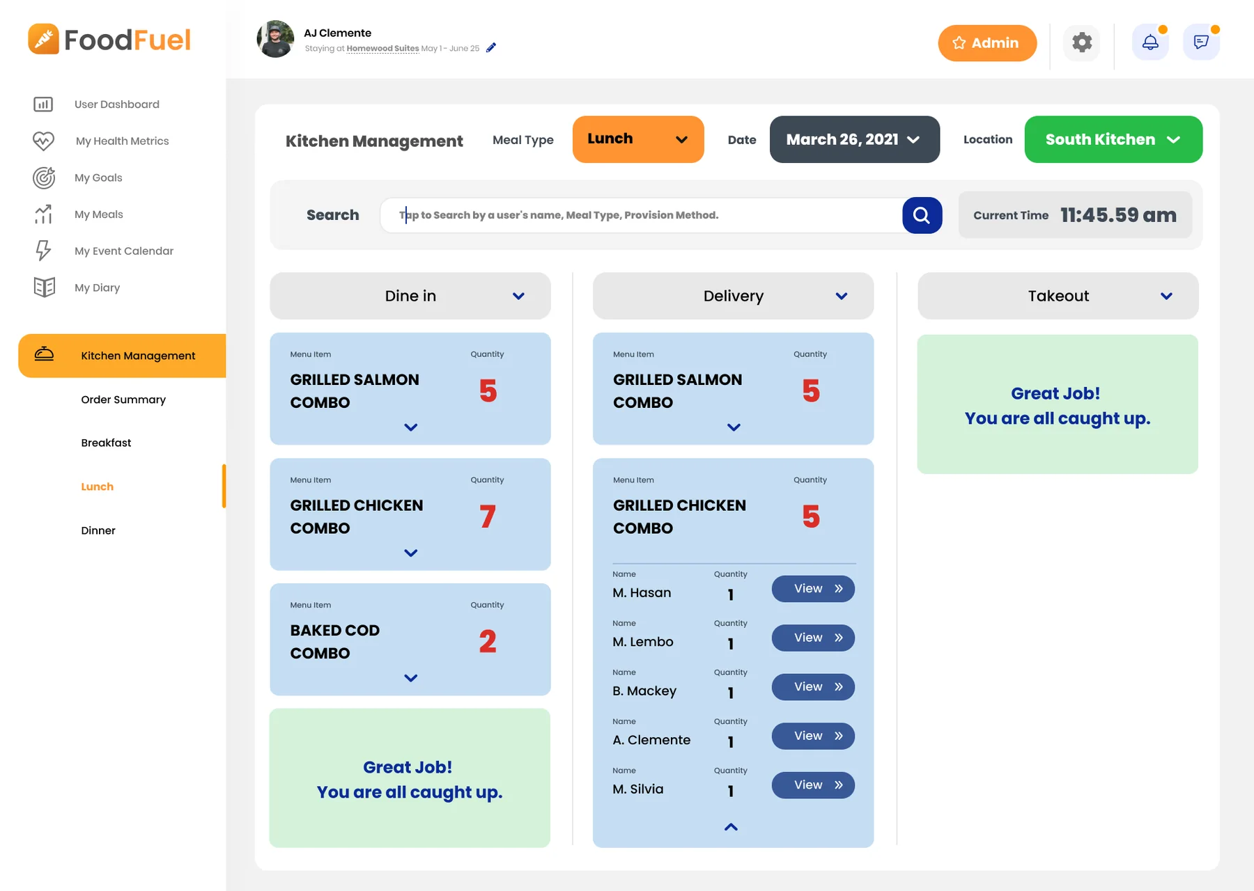
- Kitchen: the order queue for each meal and kitchen location, split by how the meal reaches the member.
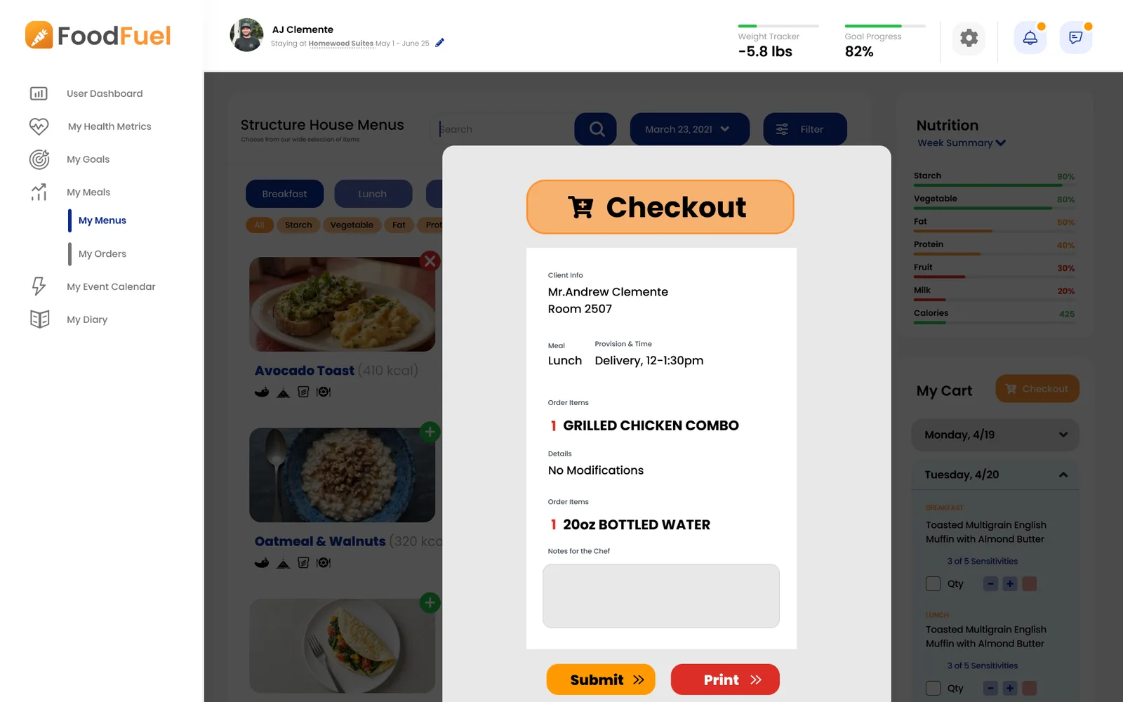
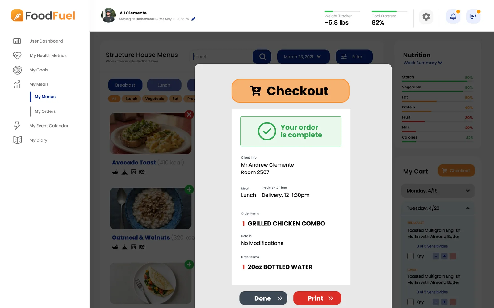
Progress you can read at a glance
The brief called for worst, current, and goal weight shown together, and for calories, weight, and exercise charted side by side, with a caveat next to the weight view: good for some, bad for others. So the Health Metrics page is a set of cards members can pin and rearrange, each with its own time range, and a privacy setting decides whether weight appears in the top bar at all.
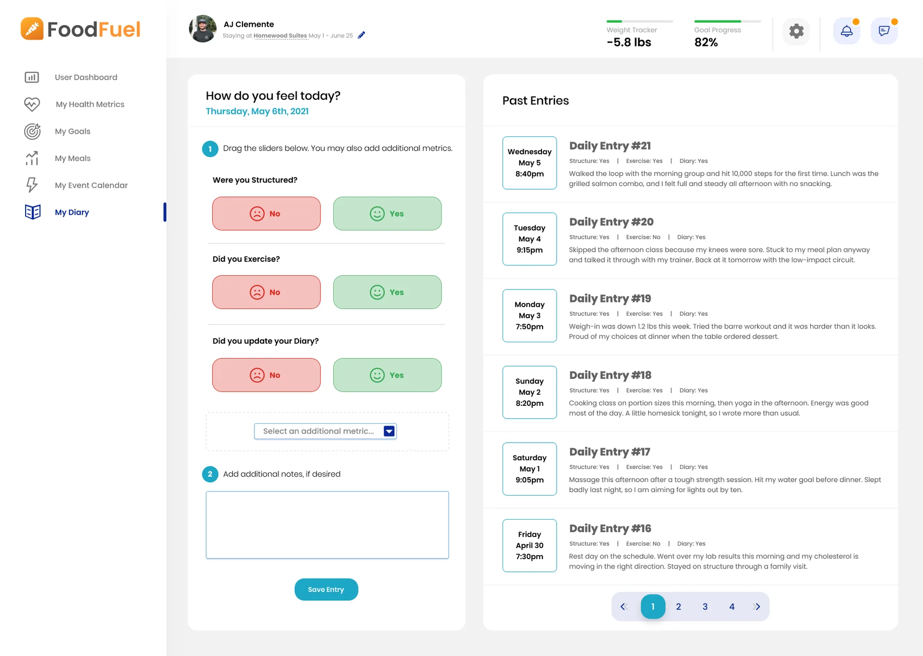
The diary started in my notes as three 1 to 10 sliders: how you felt mentally, physically, and about your choices. In the design it became a quick check-in on the questions the program cares about most (did you stay on your structure, did you exercise, did you update your diary), with room to add other metrics and notes.
The kitchen side
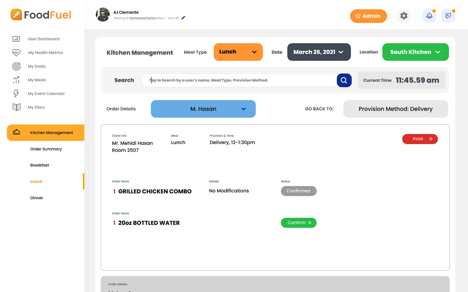
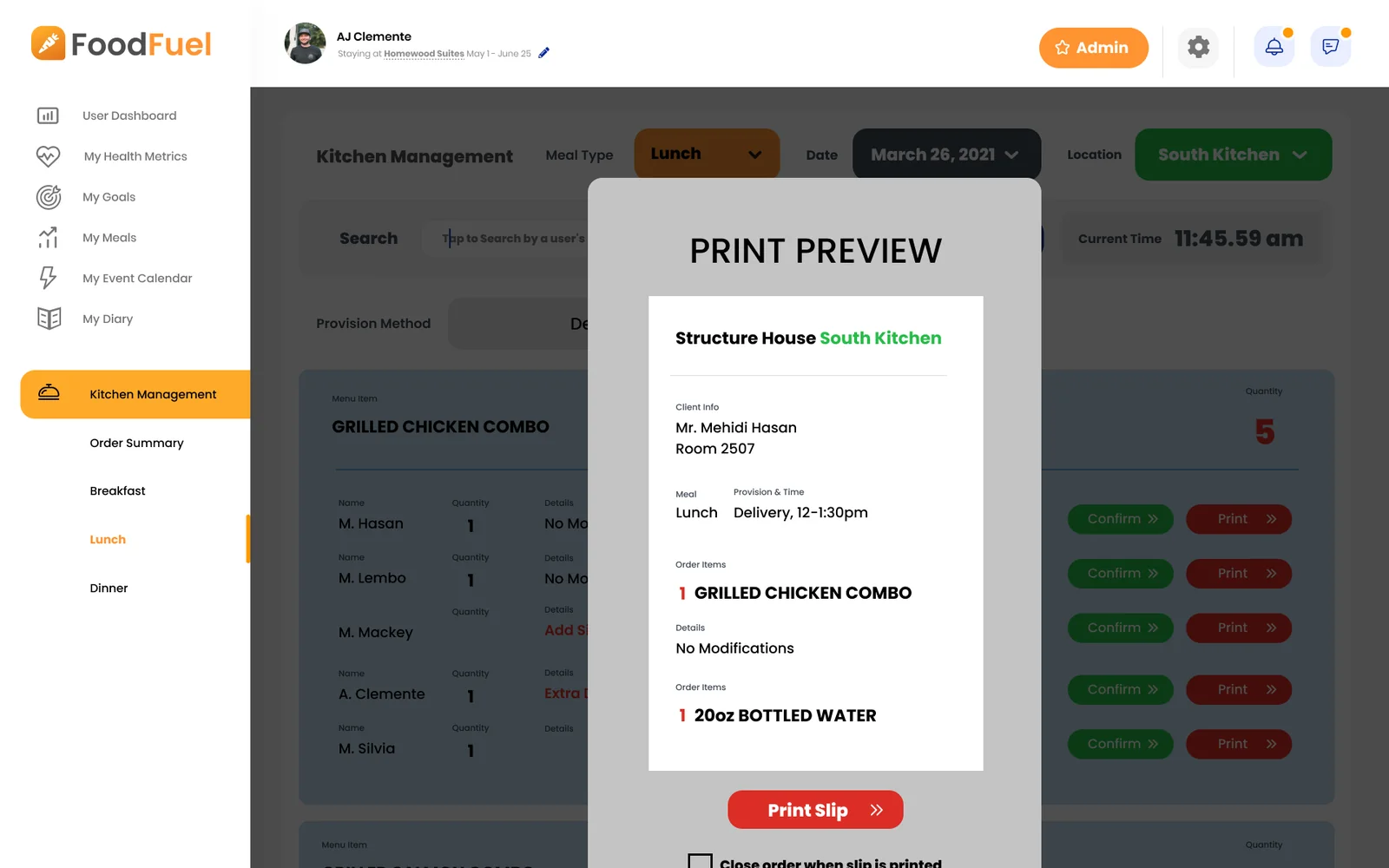
The same orders show up for the kitchen, grouped the way the cooks work: by meal, date, and kitchen location, then by dine-in, delivery, and takeout. Each dish shows how many to make, and expands to the members who ordered it. A column that’s finished says so.
Everything else
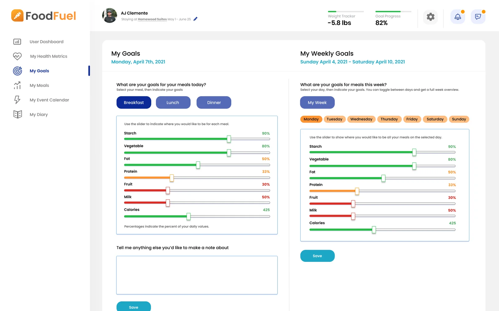
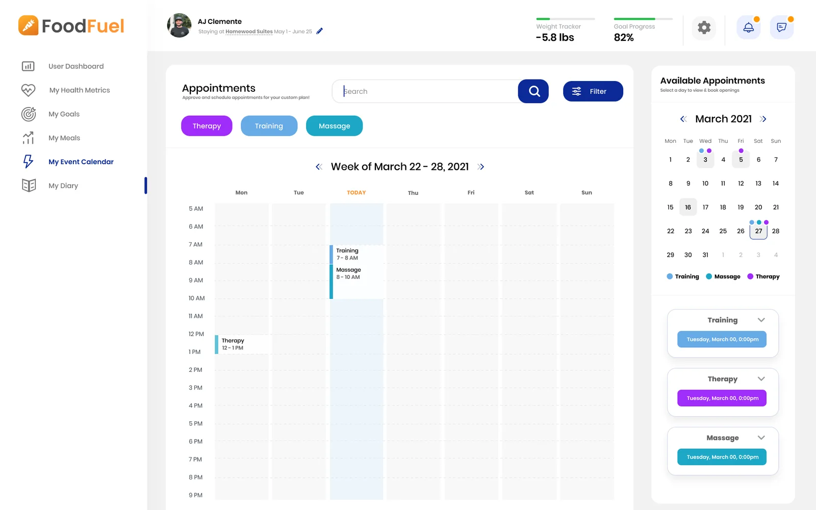
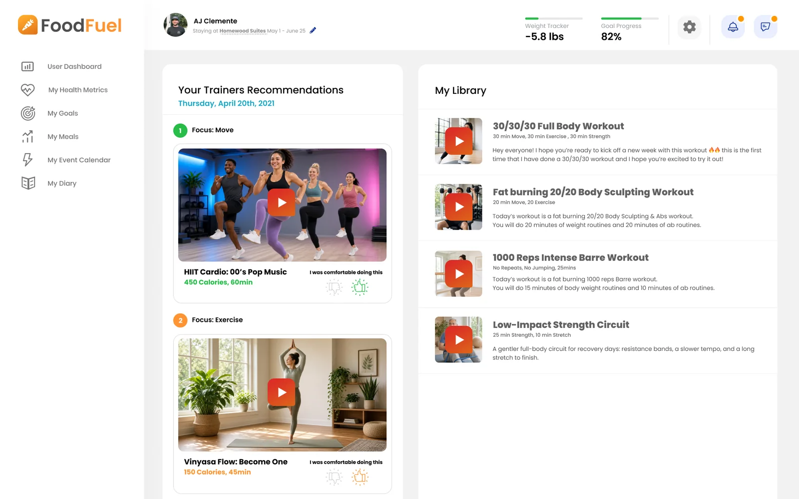
The rest of the portal covers life at the center beyond meals. Goals turn nutrition targets into food group sliders, set meal by meal or across the week. Appointments books training, massage, and therapy sessions. Training videos pair the trainer’s picks for the day, each with a focus and a quick “I was comfortable doing this” rating, with a personal library of workouts. Settings hold a member’s goals, privacy choices, and food sensitivities, along with their support staff: a personal trainer, a behavioral psychologist, and a wellness associate.
What I’d carry forward
The pin-and-rearrange metric cards, and the privacy toggle that keeps weight out of the top bar. Sensitive numbers should be easy to see when someone wants them, and easy to put away when they don’t.